

I recently received this question about church presentations:
Hey John, our staff is looking at improving the style, content, and format of our church presentations during the weekly sermon on Sundays. Do you have any guidance on church presentation best practices?
So, I answered this question on a private coaching call for digital communicators and then thought, there are probably other people wondering the same thing, so I decided to create this blog post.
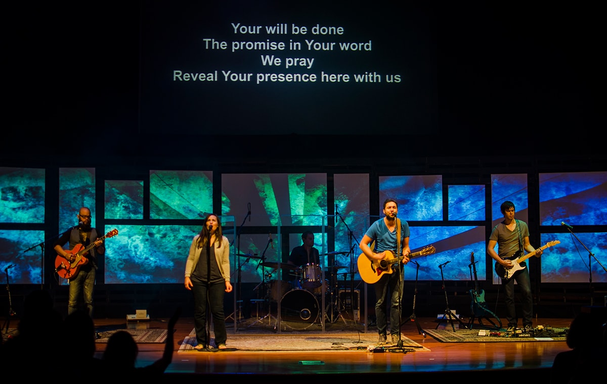
If your church doesn’t utilize IMAG (image magnification in large venues to enable audience members seated at a distance to see what’s happening on stage) in your church worship services because it’s a small church or you don’t have the capabilities to do so well, then using church presentations and graphics can really enhance your church service.
The 7 Best Practices for Church Presentations
Let’s look at 7 best practices leading churches use for designing church presentation slides for use in worship services.

1. Have Variations of the Series or Sermon Graphic
Create several version of a series graphic so you can utilize it in a variety of ways and have flexibility when building your church presentation. I always recommend creating 3 versions for use in the service:
- Title Slide with the series name and graphic in front (not meant to overlay content on)
- Sermon Slide that has a more muted background and the name of the sermon/series in the corner for overlaying scripture and main points.
- Background Slide for overlaying other content (photos, lyrics and other content)
In addition, you might also want to create some additional variations for digital use on your website and social media.
If you’re looking for free sermon series graphics and media, check out Open Resources.
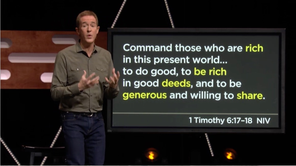
2. Format Scripture Slides for Easy Reading
When it comes to Scripture slides you want to format them for easy reading and high impact. Take a look at the screenshot from North Point above and the simplicity of their scripture slides and formatting. With this in mind, here are a few good rules to follow for Scripture slides:
- Use simple san-serif fonts. Semi-bold or bold fonts unless you have large HD screens. Some of our favorites are: Helvetica, Proxima Nova, and Myriad Pro. Font size will vary depending on the size of your screen and the distance of your viewers. See #4 in this list for guidance.
- Make sure there is good contrast with the slide background.
- Include the verse reference on each slide (at the end). Remove verse numbers within the text to make for easier reading.
- Use the 7×4 rule for the number of words on a slide. 7 words per line max, 4 lines per slide max. Generally 25 words per slide max. The example above from NorthPoint uses a 7×5 framework plus the Scripture reference and only contains 26 words. Most of their slides contain much less words.
- Keep the formatting simple and consistent. Minimize punctuation and the number of colors. Keep the alignment consistent from slide to slide.
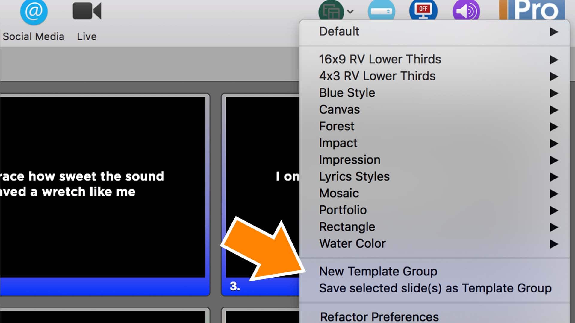
3. Utilize Templates In Your Church Presentation Software
Utilizing templates in your church presentation software is the fastest way to achieve a cohesive look. Our favorite church presentation software is ProPresenter running on a Mac, but even if you’re using Easy Worship, MediaShout or some other presentation software, you should be able to save templates.
Templates ensure that your slides are using the same font, font size, formatting, placement, alignment and background. You can have different templates for different types of content. One for sermon points, one for scripture slides, one for quotes, one or more for song lyrics, etc. Templates will save you time and make your slides consistent. Watch this tutorial on how to create templates with ProPresenter.
4. Use Video to Enhance the Message
Utilizing video is a great way to enhance the message and the worship experience. Whether you use a sermon video bumper that ties into the sermon topic and provides a nice transition or utilize other video elements in the service, consider using video when appropriate.
The video above was created by Jared Hanline for a series we did a few years ago called A Dangerous Journey. It was all about the apostle Paul and served as a transition before the sermon and to set the scene. We had a couple of different ones that we used as the series progressed.

5. Be Creative with Your Song Lyrics
Song lyrics provide a great opportunity to be creative with your slide design. If you’re not using IMAG, then you can utilize a series background graphic or motion graphics to create visual interest and enhance the experience.
Here are 20 lyric slide designs that will inspire your creativity.

6. Setup Slides Ahead of Time for your Church Presentations
I’m always surprised at the number of churches that try to setup their slides on Sunday morning just before the service. This creates a lot of stress for those involved and results in more mistakes and errors.
Here a few tips to make your church presentation slide less stressful and more effective:
- Run through song lyrics during band rehearsal. If this isn’t an option because your band practices in a different space or some other reason, then at least listen to recordings of the songs they are going to play and prepare the slides that way.
- Ask your pastor for sermon notes a day or two before your first service and set them up ahead of time. This provides time for you to get everything correct and find or add supporting materials.
- Have someone else double check your slides to catch any errors or mistakes. If you have a volunteer setting up your slides, then you can check their slides.
At my church, we’ve had volunteers setup and create the church presentation slides each week. We were able to achieve this by having detailed setup instructions and a specifications sheet so that volunteers knew what templates and settings to use to have consistency from week to week.
7. Be Tasteful
When it comes to your slide design, be tasteful. You want to enhance the service not distract people. Keep this in mind when selecting graphics. Avoid using clipart and try to use photos.
Keep your transitions and animations simple and don’t crazy just because your presentation software provides a lot of options.
Looking for more Best Practices for your church? Check out our Whiteboard Wednesday video: Best Practices for Media Teams
What are your best practices for church presentations? Add them in the comments below.